A year ago at its annual Relativity Fest user conference, the e-discovery company Relativity announced that this year’s Relativity Fest would feature the introduction of a next-generation user interface for its cloud discovery platform RelativityOne.
Although this year’s Relativity Fest has been converted from a live conference to a free virtual event, the company nevertheless held to its word of introducing the new user interface. Called Aero UI, the new interface makes its formal commercial release today, a week ahead of the Sept. 21-23 conference.
Aero UI, Relativity says, gives users the same access to the power and security of RelativityOne as the prior interface, but with a new intuitive UI that streamlines processes and increases efficiency.
“We built Aero UI with all users in mind to simplify the inherently complex processes of managing large volumes of data, without compromising access to the most advanced technology in the industry,” Chris Brown, chief product officer, said in a statement announcing today’s launch.
During a demonstration to preview the product last week, Kyle Disterheft, group product manager, told me that about half of RelativityOne customers have already been upgraded to Aero, and the rest will be this week.
While Aero is an update to the cloud platform, it will also later be deployed within the on-premises product, Disterheft said, but not until sometime in 2022.
Relativity’s goal with Aero was to simplify the experience of using the platform for users of all types. In the past, he said, the product had been optimized for database administrators and other more-technical users. With Aero, the company wanted to optimize the UI for new and non-technical users, while retaining all the “power” functions that advanced users want and need.
Even though Aero is presented as a new user interface, the company says it is in fact a rearchitecting of the platform, with five major enhancements:
- Modern aesthetics. RelativityOne has been redesigned throughout the platform to improve usability, with a more contemporary look and feel, usability improvements through clearer button definition, fewer items on the screen by default, and more obvious page hierarchy.
- Next-gen document viewer. The document viewer in Aero provides faster performance and navigation throughout review, including faster doc-to-doc speeds and cleaned-up icons and text. It uses a REST API to allow third-party developers to more easily integrate with it.
- Workflow-based navigation. A new workflow-based navigation structure makes it easier for users to find what they need and improves how they navigate between pages to accomplish tasks and move through their workflow.
- Faster performance. Relativity says that performance improvements make navigating across pages must faster, with an 81% improvement in jump-in times and 40% improvement in page load times.
- Automated workflows. Users can now automate and templatize manual work to eliminate steps in the case set up process to reduce human error and focus on more value-add work. This feature will be available Sept. 26 for U.S. customers and Oct. 10 globally.
The new navigation structure moves navigation tabs from the top of the page to a sidebar on the left. It also reduces the number of visible tabs to those most commonly used in a standard workflow, in order to reduce screen clutter. To see the full array of tabs, one click opens the All Tabs menu.


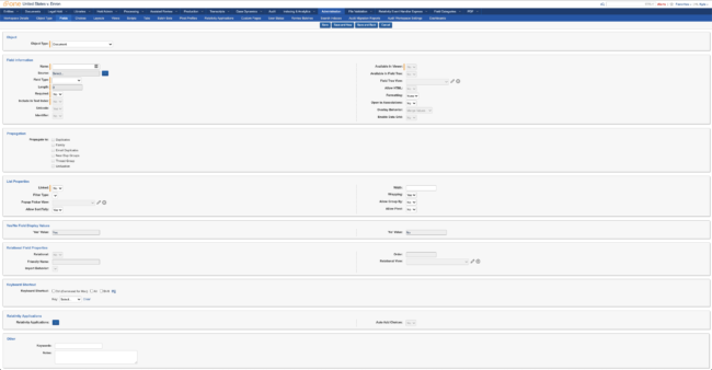
One challenge with designing e-discovery software is achieving the dual goals of making it easy to use while also retaining features for power users. The two images above offer an example. (Click to enlarge.) This shows the page used by administrators to create new fields.
Previously, every available option was crammed into a single page. With Aero, the same options remain available, but a simpler interface allows a user to get started more quickly and easily.
Regarding the automated workflows, RelativityOne will include an out-of-the-box set of templated workflows that administrators can flip on or off. Users will also be able to create their own, which they likewise will be able to flip on or off.
One interesting note about the aesthetic redesign is that the company realized that its prior UI was not optimized for color blindness, reducing the ability of many to make full use of the platform. In a recent blog post, Relativity explains its process of redesigning the color palette to maximize accessibility.
If you are interested in learning more about Aero UI, there will be several sessions about it during next week’s Relativity Fest. As I noted above, the conference is free and you can register here.